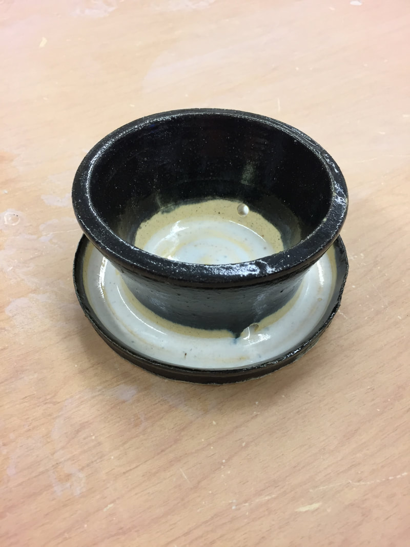
 this project is a planter and it is glazed in a black and white theme. it has a smooth texture and is 3 inches wide from the lip but on the bottom is 5 inches wide by 4 1/2 inches tall. i glazed the top in black and left the inside untouched until i dumped the white glaze on the inside. when the white was on the inside is went through the holes in the side of the planter and filled the rest of the project. the skill i learned was that i need to ass more glaze to the more runny glazes to make it more thick and so it comes out with a better glaze over top of it. color is used to create the boundaries around the black and white so they do not touch or seem like they are. unity is seen in this project by the sole purpose that, the black and white are two polar opposite colors from each other and go well together. what the project says about me is that i can do better, it shows others that there is always room for improvement.
0 Comments
Leave a Reply. |
AuthorWrite something about yourself. No need to be fancy, just an overview. Archives
December 2017
Categories |
 RSS Feed
