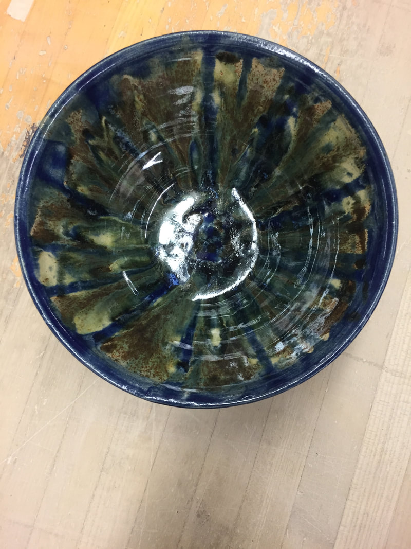
 this project is my theme project, i glazed it by splattering Forrest green, black and cobalt blue all around the bowl. it stands 4 1/2 inches tall and 8" inches wide. i glazed it by splatter painting the whole thing with eye droppers. after all the glaze was on i put white all over the project to make it run. the new skill i learned was was creating a large bowl and glazing the entire project evenly. value is used in the project to show all the light and dark colors that are scaterd around the inside of the bowl. balance is seen in the project with all the colors and textures and shapes that are all combined in the project. what this project shows about me is that i can prove to myself i can make projects that are very amusing to look at to the eye.
0 Comments
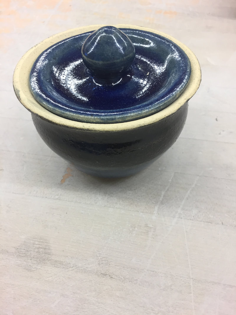
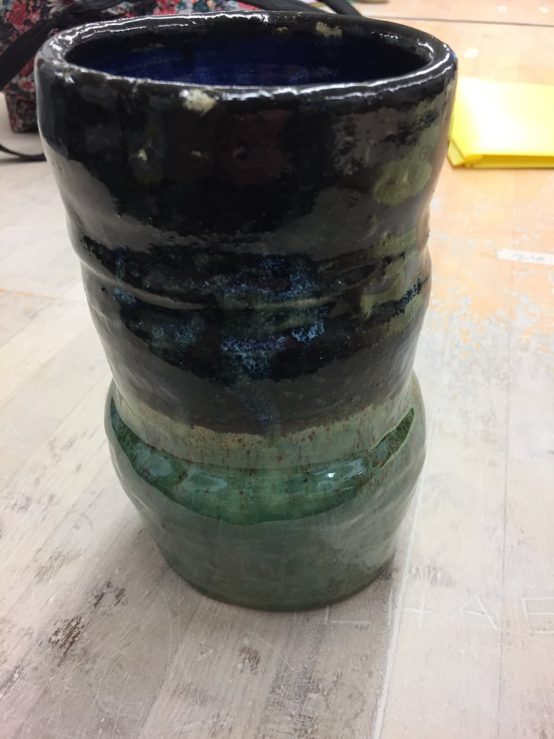 this project is my groups franken pot, it stands 12" tall by 4 1/2" wide. it has a smooth surface, the glazes are dark black on the inside, with cobalt blue that drips down the inside. on the outside i used the black on the op half and dripped blue along side it, then dipped the bottom half in forest green. the new skill i used was trying to get the whole project have glaze on it. this was a challenge because it is a large project and it took some time to do. light and dark colors are used to split the two colors right down the middle. movement is seen in the project to transfer the color from light to dark. the importance of this project was that i was not the only one that made this, my team and i had to work together to get all the pieces together.
these projects that i made are my set of three, they all stand about 4 inches tall and 9 inches wide. i glazed them all the same with forest green dipped on one side and cobalt blue dipped on the other side; in the center they mix and create a lighter color. the new skill i learned was making three bowls roughly the same size and with the same glaze. line was used and how it draws the spectator towards the middle of the bowls. harmony is used in the projects the see how the glazes came together. the importance of this project is to see what all i am capable of how i can make similar projects to each other.
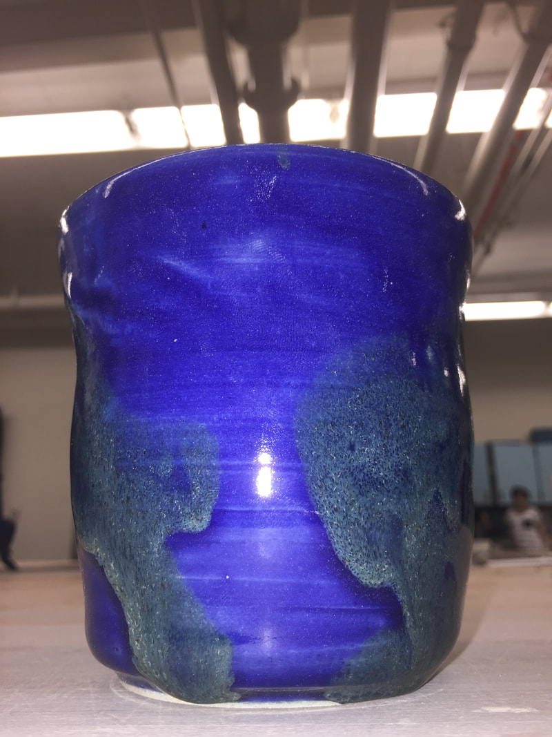 the project that i made is a tall project, it stands 7 inches tall by 3 inches wide. it has a smooth surface with the base color being cobalt blue and the forest green being the accent color how it goop's down the side. i glazed the tall by initially having it all go into the cobalt blue and with my hand i had forest green on it and i grabbed it combining the two colors. the new skill i learned was having the walls all be the same height and nothing bigger than the other. how i did this was i trimmed the top just before pulling it off giving me that smooth top. texture is used in the project with the forest green how it rises off the project and can be seen. harmony is used in this project to see hoe the blue and green go well together even though the green down not cover most of the project. the meaning of this project was trying something new, i wanted to see what would happen if i glazed the project with my hand; this is what it turned out like.
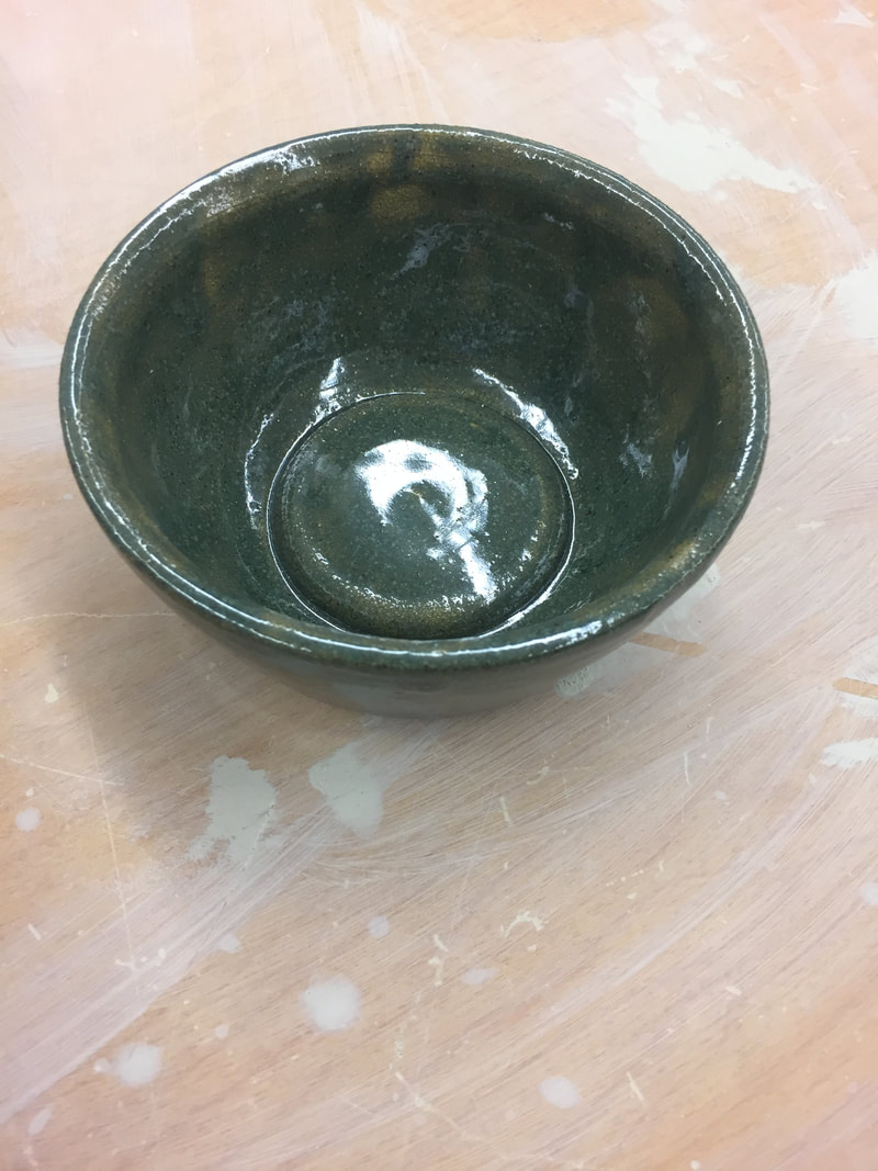 this project is a bowl, it is Forrest green all the way around with a smooth texture and it stands 3 inches tall by 4 1/2 inches wide. i glazed the whole project into the forest green and it turned out different due to the fact that it was all alone with no other glazes on it. the new skill i learned is that, many projects do look better with more than just one glaze on it. form is seen on the inside of the bowl where there is a rise from the bottom creating a 3D affect. movement is used with the rise in the bottom of the bowl when you look at it, it almost confused you as to why it is there. the importance of this project is showing the viewer what all different types of bowls look like, there is no specific rules in making one.
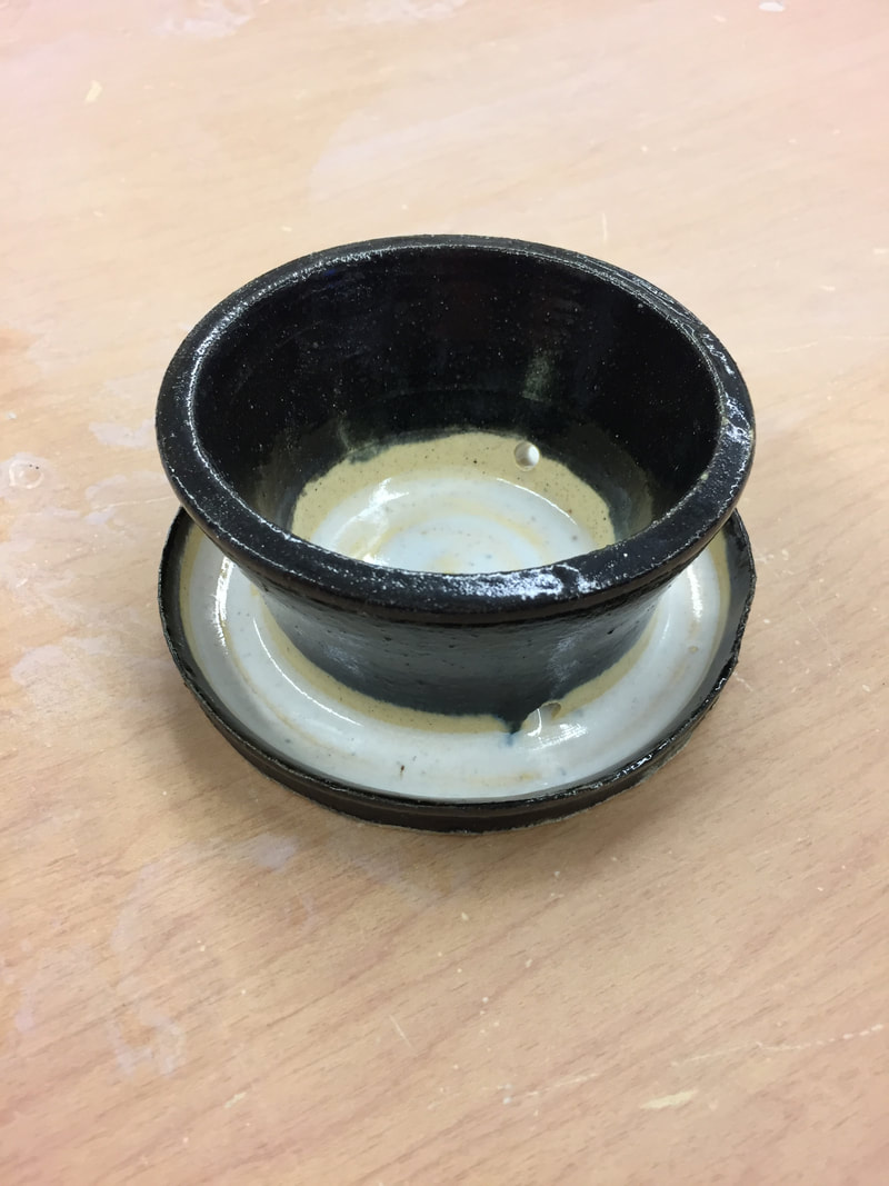 this project is a planter and it is glazed in a black and white theme. it has a smooth texture and is 3 inches wide from the lip but on the bottom is 5 inches wide by 4 1/2 inches tall. i glazed the top in black and left the inside untouched until i dumped the white glaze on the inside. when the white was on the inside is went through the holes in the side of the planter and filled the rest of the project. the skill i learned was that i need to ass more glaze to the more runny glazes to make it more thick and so it comes out with a better glaze over top of it. color is used to create the boundaries around the black and white so they do not touch or seem like they are. unity is seen in this project by the sole purpose that, the black and white are two polar opposite colors from each other and go well together. what the project says about me is that i can do better, it shows others that there is always room for improvement.
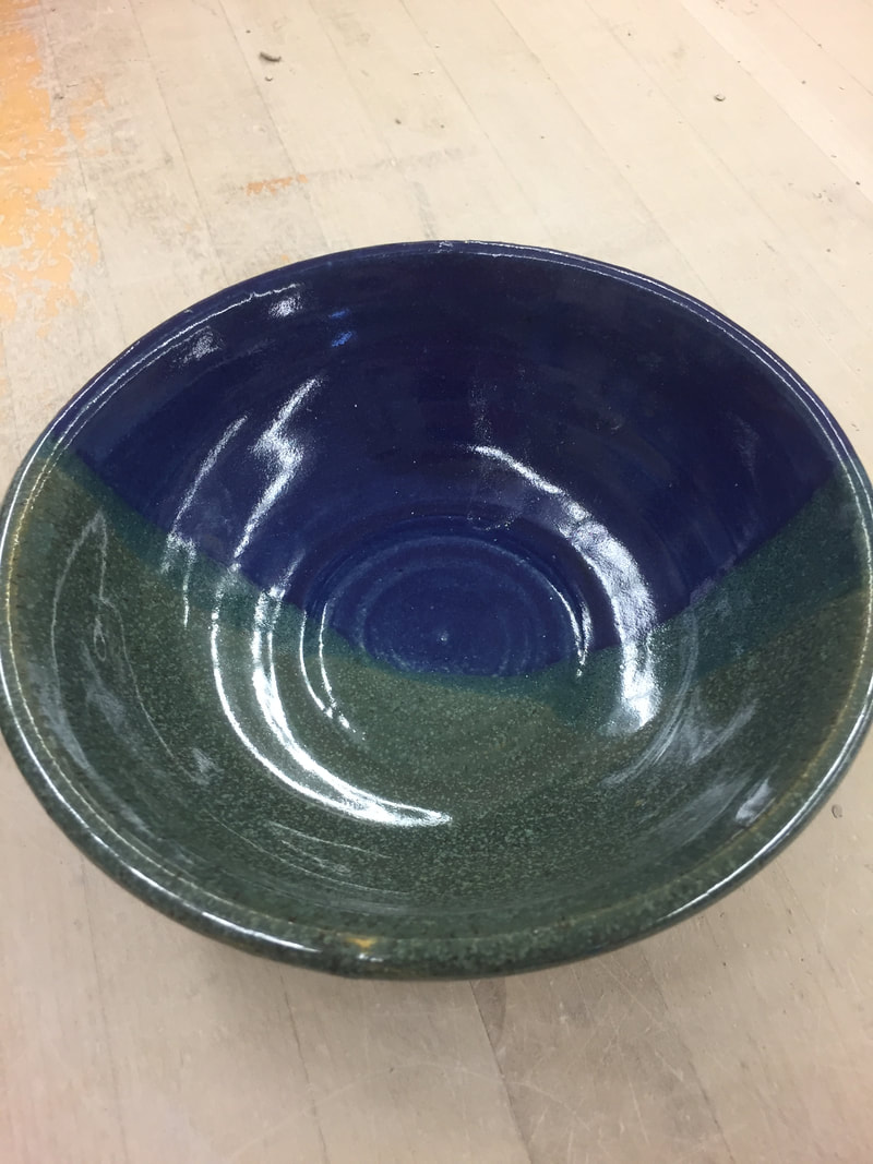
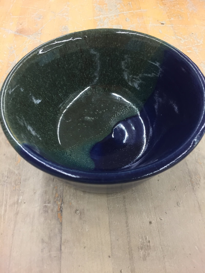
 i created a large bowl and is is 7 inches wide and 5 inches tall. is is glazed in a dark blue that is still unnamed and a forest green, with a smooth surface and bubbly texture on the inside. i glazed the dark blue side first and then the other side in the forest green, i dipped the forest green further in to get the mix of colors on the inside of the project. the new skill i learned was when the project came out of the kiln, there was glaze that ran down to the bottom side of it, so i learned how to glaze in a much easier way buy making it look more clean and like it was never even there. line was used because there is a line that reaches through this entire project and it leads all the way around. unity was used in this project to see how the two different shades of green correspond to the dark blue and compliment it. The meaning of this project is that it shows my audience i am capable of more than just throwing a project, the other half to this class is the glaze and it is great.
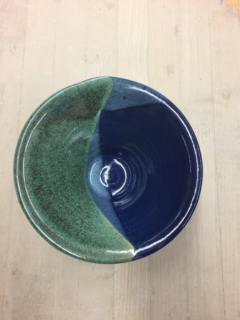
 this project that i made is a large bowl, it is 3 1/2 inches tall and 8 inches wide. It has a smooth surface and is glazed in a dark blue which has no name yet and a forest green, half and half. when the two colors met in the middle the combined and created a faint green color. The new skill i learned was glazing the perfect amount and thickness on the project, and seeing them come together very well. value is seen through the glazes how the dark blue and the light green contrast with each other very well. harmony is used in the project with the elegant change from the green to blue. the importance of this project is that i am making progress in this class with my glazing ability. I see it improve every time i glaze and this is a prime example of that.
|
AuthorWrite something about yourself. No need to be fancy, just an overview. Archives
December 2017
Categories |

 RSS Feed
